没养龙虾(OpenClaw),先养个马(Hermes)来做生物信息学
AI 发展日新月异,还没来得及养龙虾,马(Hermes)又来了。“弃龙虾(OpenClaw)、选爱马仕(Hermes)” ,似乎正在形成共识。真是应了那句话:只要学得慢,就不用学。
既然如此,那么我们就先不管龙虾,今天先来安装一个马试试。
安装
我们先看一下 Hermes 的 GitHub 主页:https://github.com/nousresearch/hermes-agent
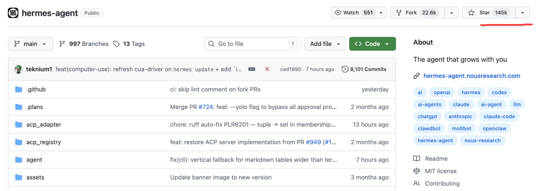
今天(2026-05-12),hermes 在 GitHub 上有 14.5 万颗星,这对于才火起来 1 个月左右的项目来说,已经非常成功了。
进入文档页面:https://hermes-agent.nousresearch.com/

我们复制安装命令:
curl -fsSL https://hermes-agent.nousresearch.com/install.sh | bash运行安装——我这里是 Linux 系统。在运行这条命令之前,先要确保系统安装了Python 3.11。
配置
运行hermes setup

我们选择第一项:Quick setup。
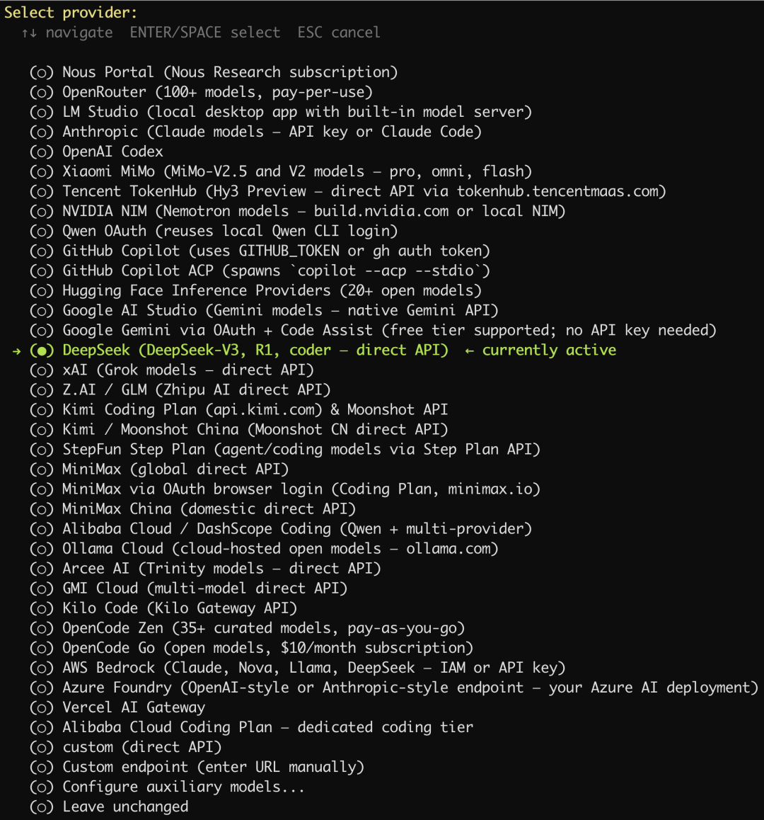
设置大模型提供商
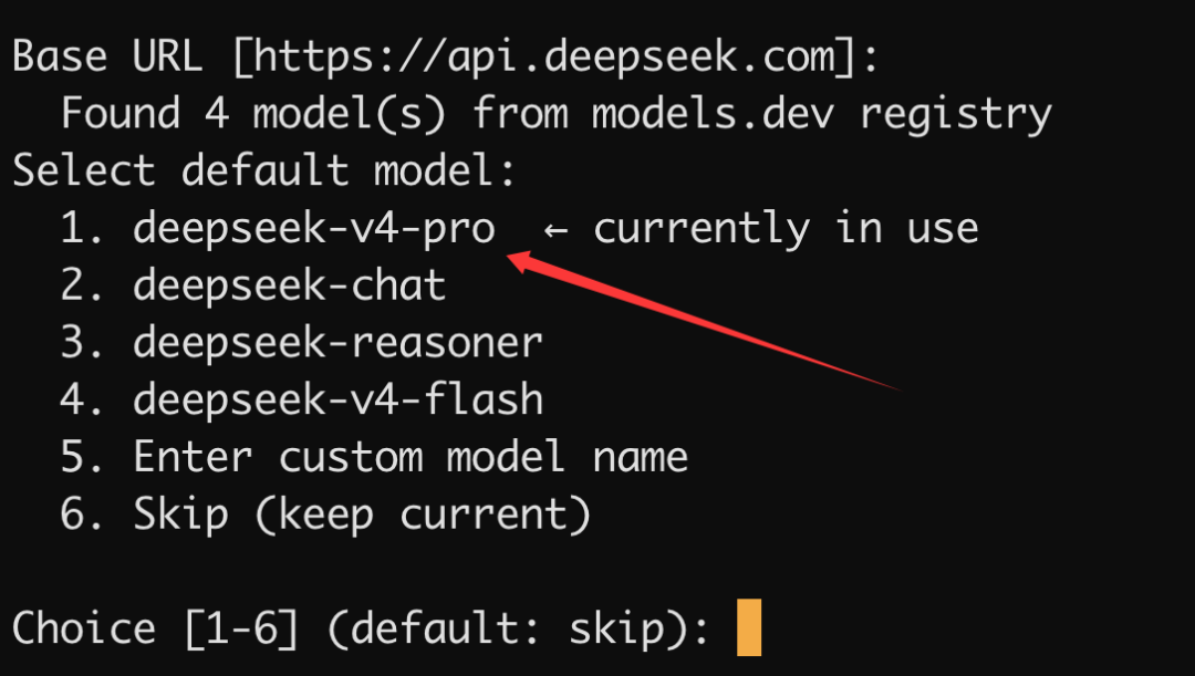
我们这里选择使用 DeepSeek。
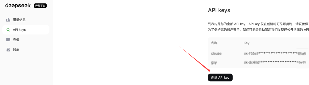
我们先到 DeepSeek 官网的开放平台申请好 API Key:
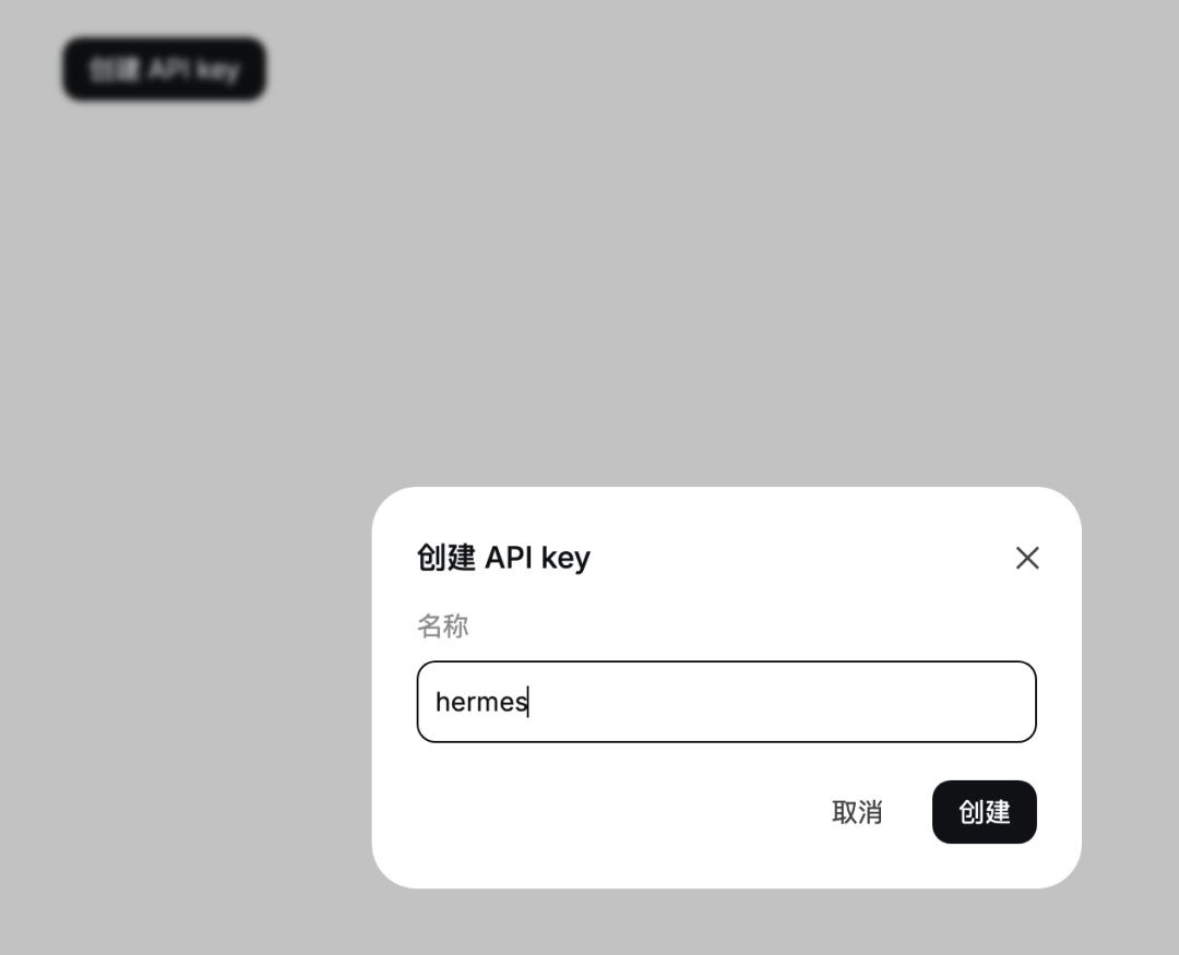
取一个名字,比如:hermes
然后回到终端,在这里输入刚才创建的 API key:

接着 Base URL 填写这个:https://api.deepseek.com
选择模型:
选择终端后端
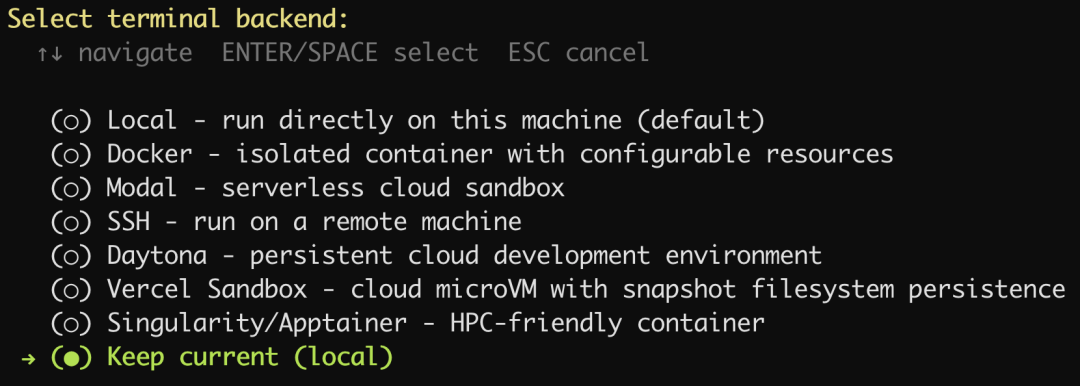
保持默认选项就好了。
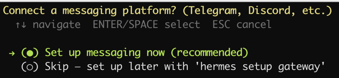
设置消息平台
选择 QQ:
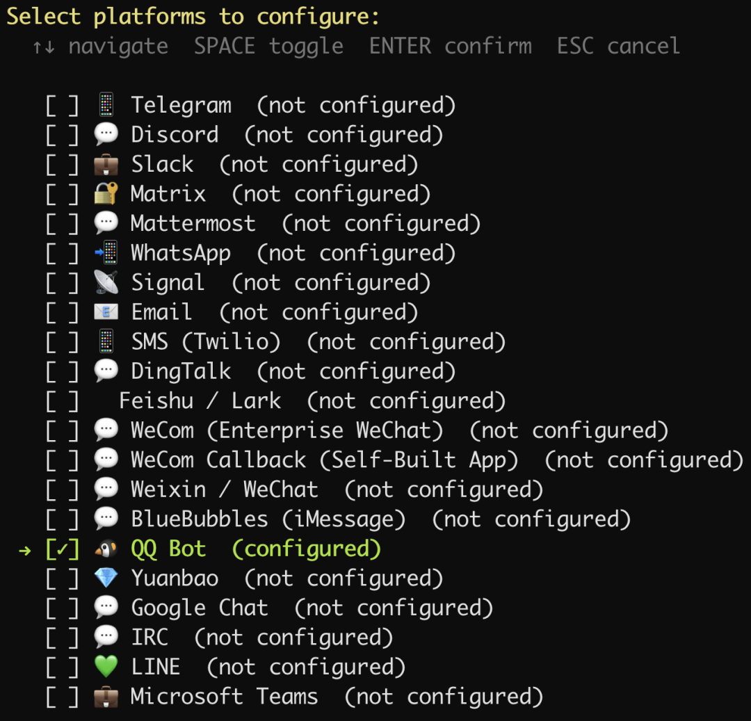
如果终端没有出现二维码,那么就复制提示的链接,到 QQ 开放平台创建一个 QQ 机器人,我们给它取一个名字:Hermes

配置好之后:
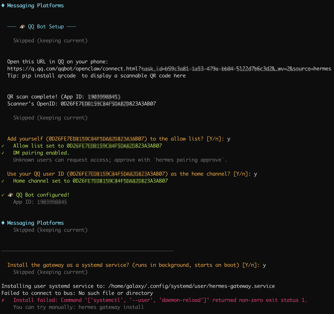
最后我们希望小马能常驻服务器,于是同意安装程序将其设为系统服务,这样重启服务器 hermes 也自动启动了。
但是出现了一条错误,原始是我们的当前账号galaxy没有添加系统服务的权限。
在 root 下执行:
# 1. 赋予 galaxy 用户常驻权限(确保退出登录后服务依然运行)
loginctl enable-linger galaxy

# 2. 切换到 galaxy 用户并进入对应目录
su - galaxy
cd /home/galaxy/.hermes/hermes-agent

# 3. 运行安装命令
hermes gateway install
打声招呼

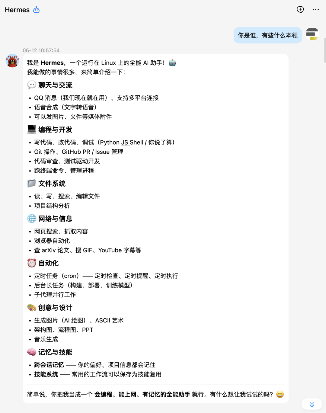
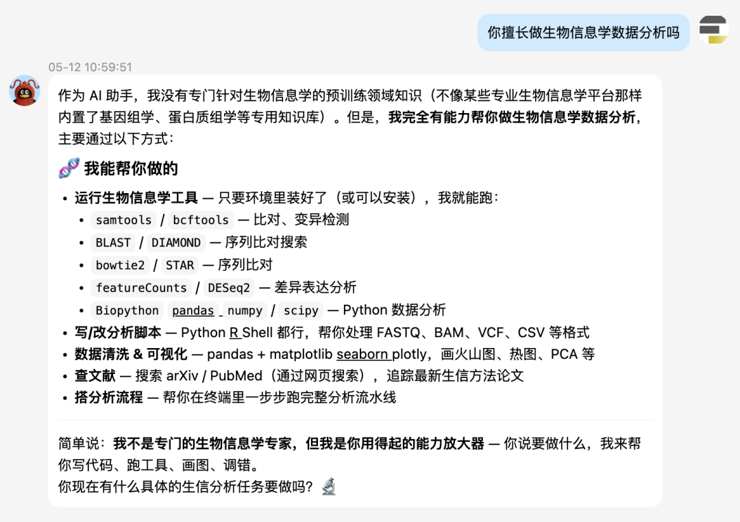
要在 QQ 上跟 hermes 对话,首先必须要创建好机器人并且跟 hermes 配对好,就像蓝牙配对一样。其次hermes它只是一个智能体,它能工作要依赖于大模型,因此必须为其配置好大模型,我们这里用的是 DeepSeek v4。
可以看到,前面跟机器人对话它没反应,就是没有配置好。
单细胞学习路线图
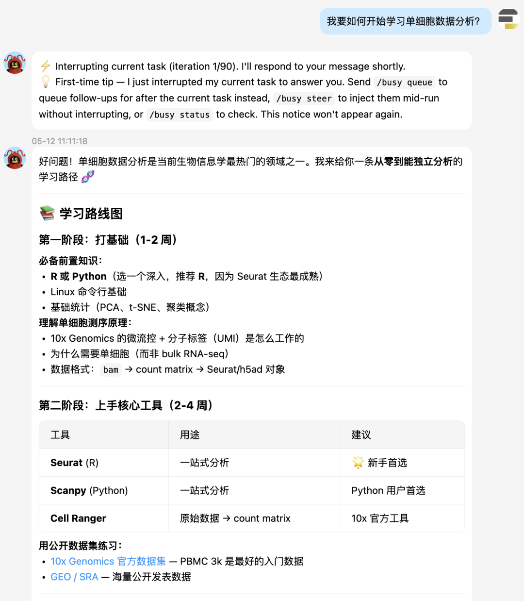
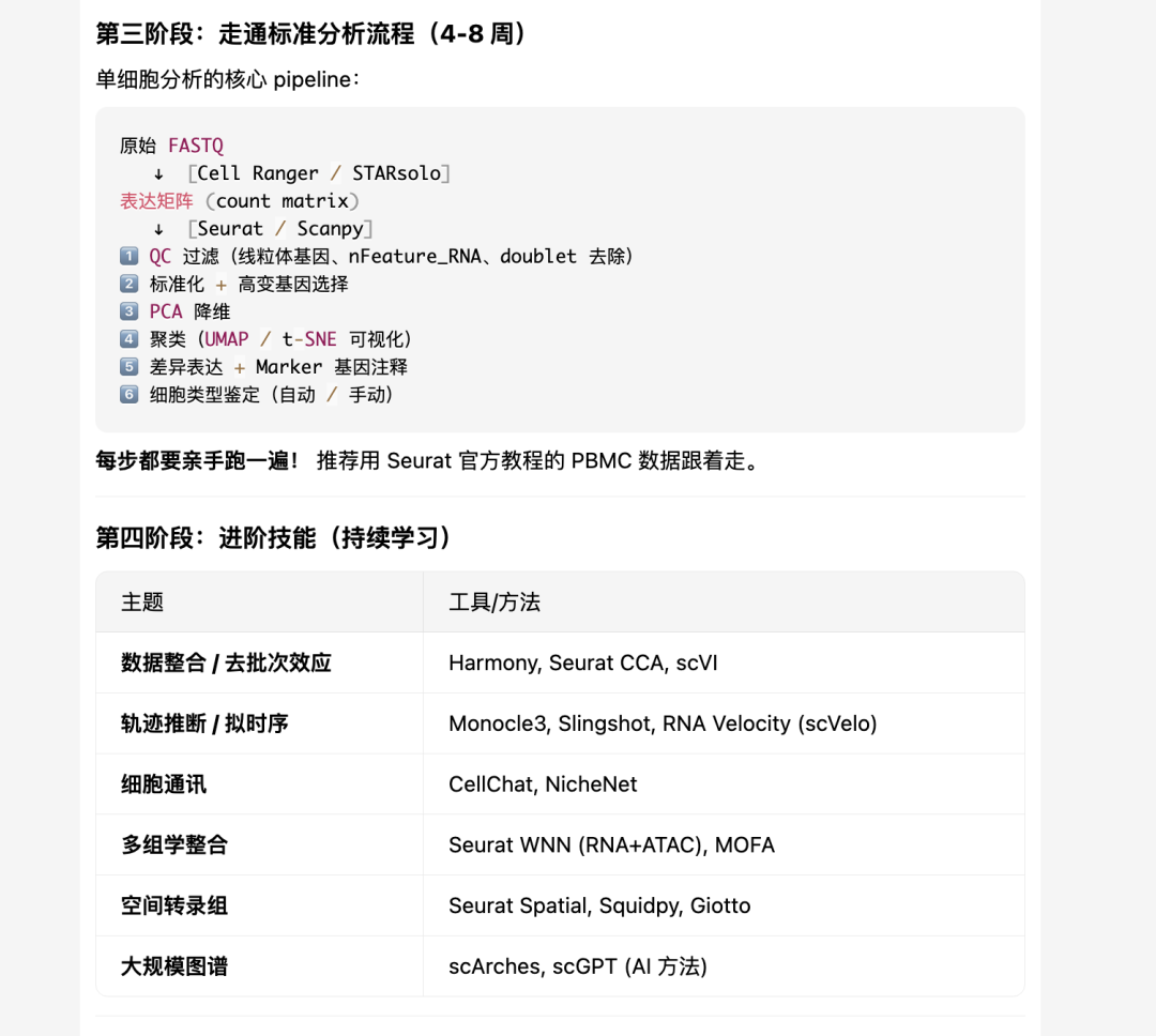

不得不说,hermes给的单细胞学习建议还是非常科学客观的。先是打语言基础,然后是核心工具的掌握:Seurat,Scanpy。接着是标准分析,进阶分析。
单细胞标准分析
大家接下来看hermes的实战表演吧。
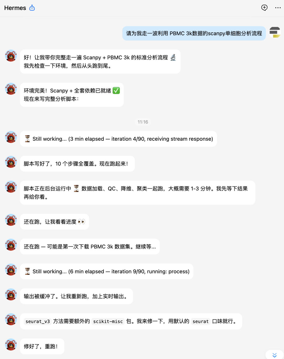
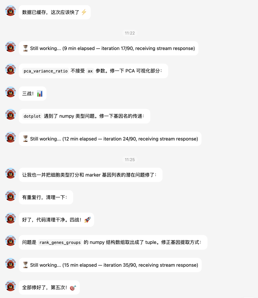
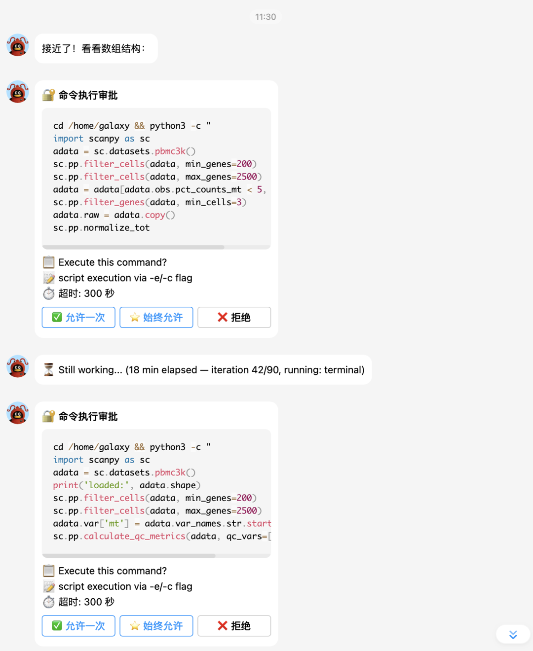
下面让它补一个celltypist分析:
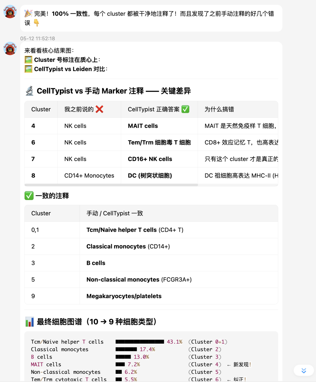
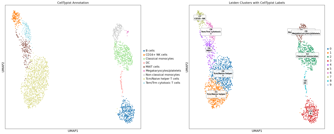
最终 UMAP 图:
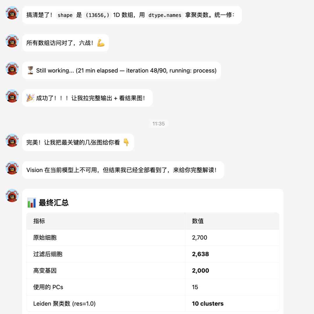
最后总结
有意思的是,hermes会自动将分析过程提取成skill,这或许就是它跟OpenClaw很大的不同之处。后者更依赖人工编写skill。
比如我们刚才的分析就自动保存在
/home/galaxy/.hermes/skills/data-science/single-cell-scanpy目录下:
.
├── references
│   ├── celltypist_pitfalls.md
│   └── rank_genes_groups_structured_array.md
├── SKILL.md
└── templates
    ├── celltypist_annotation.py
    └── pbmc3k_pipeline.py

2 directories, 5 files
SKILL.md
---
name: single-cell-scanpy
description: Single-cell RNA-seq analysis with Scanpy — QC, normalization, HVG, PCA, UMAP, clustering, marker detection, and cell-type annotation (manual marker + CellTypist automated).
---

# Single-Cell RNA-seq Analysis with Scanpy

Standard scRNA-seq analysis pipeline using Scanpy (Python). Covers loading data through cell-type annotation, with tool-specific pitfalls documented below.

## Triggers

- User asks to run single-cell analysis, scRNA-seq, Scanpy, PBMC analysis
- User mentions UMAP, Leiden clustering, marker genes, Seurat/Scanpy
- User wants to analyze `.h5ad` files or 10x Genomics data

## Standard Pipeline (10 Steps)

1. **Load data** — `sc.datasets.pbmc3k()` or `sc.read_h5ad()`
2. **QC filtering** — mark MT/ribo genes, `sc.pp.calculate_qc_metrics`, filter cells by n_genes and %MT
3. **Normalization** — `sc.pp.normalize_total(target_sum=1e4)` + `sc.pp.log1p()`
4. **HVG selection** — `sc.pp.highly_variable_genes(n_top_genes=2000)` (use default `seurat` flavor unless `scikit-misc` installed)
5. **Regress + scale** — `sc.pp.regress_out(['total_counts', 'pct_counts_mt'])` then `sc.pp.scale(max_value=10)`
6. **PCA** — `sc.tl.pca(svd_solver='arpack', n_comps=50)`
7. **Neighbors + UMAP** — `sc.pp.neighbors(n_pcs=15)`, `sc.tl.umap()`
8. **Clustering** — `sc.tl.leiden(resolution=1.0)`
9. **Marker genes** — `sc.tl.rank_genes_groups(groupby, method='wilcoxon', use_raw=True)`
10. **Cell-type annotation** — manual marker-based or automated via **CellTypist** (recommended: majority voting per cluster, far more accurate than manual markers)

## CellTypist Automated Annotation (Step 10-b)

CellTypist (Oxford Teichmann Lab) uses a pre-trained model with 98 immune cell types and 4164 gene features. **Always prefer this over manual marker-based annotation** — manual markers routinely misclassify MAIT cells, CD8+ Tem/Trm, and DCs (all of which express NKG7/CCL5/GZMB and get confused with NK cells).

```python
from celltypist import models
model = models.Model.load(model='Immune_All_Low.pkl')  # auto-downloads

# CellTypist needs log-norm data; create clean copy
adata_ct = adata.raw.to_adata()
adata_ct.obs = adata.obs.copy()
sc.pp.normalize_total(adata_ct, target_sum=1e4)
sc.pp.log1p(adata_ct)

predictions = celltypist.annotate(
    adata_ct, model='Immune_All_Low.pkl',
    majority_voting=True, over_clustering='leiden'
)
adata.obs['celltypist_label'] = predictions.predicted_labels['majority_voting'].values
```


See `references/celltypist_pitfalls.md` for model output columns, data prep, and manual-vs-automated comparison.
Full working script: `templates/celltypist_annotation.py`.

## Critical Pitfalls

### P1: `rank_genes_groups` yields structured numpy arrays

- `adata.uns['rank_genes_groups']['names']` is a 1D structured recarray
- Shape = `(n_genes,)` — NOT `(n_genes, n_clusters)`
- Number of clusters = `len(names.dtype.names)` — NOT `shape[1]`
- Access pattern: `names[rank][cluster_index]` — rank is gene rank (0=top), cluster_index is integer
- Always cast genes to `str()` before passing to plotting functions

```python
names = adata.uns['rank_genes_groups']['names']
n_clusters = len(names.dtype.names)
top_gene_cluster0 = str(names[0][0])  # top gene for cluster 0
```

### P2: `sc.pl.pca_variance_ratio` does not accept `ax` parameter

- Use separate `plt.figure()` calls; save and close each individually
- Same for `sc.pl.pca()` — it manages its own figure

### P3: Dotplot `var_names` must be plain Python strings

- Passing numpy record types (from structured arrays) causes `TypeError: unhashable type`
- Always convert: `var_names=[str(g) for g in gene_list]`

### P4: `sc.tl.score_genes` needs a flat gene list

- Passing `list(marker_dict.values())` gives list-of-lists — wrong
- Flatten: `[g for genes in marker_dict.values() for g in genes]`

### P5: `sc.tl.rank_genes_groups` should use log-normalized data

- Despite `use_raw=True`, log-normalize before calling or expect a warning
- The pipeline above normalizes + log1p before HVG, so data is ready

### P6: Vanilla `seurat` HVG flavor works out of the box

- `flavor='seurat_v3'` requires `scikit-misc` (not commonly pre-installed)
- Default `flavor='seurat'` needs no extra packages

### P7: CellTypist — majority voting output has no `conf_score` column

- `predictions.predicted_labels` columns: `['predicted_labels', 'over_clustering', 'majority_voting']`
- Use `majority_voting` for cluster-level consensus; no separate confidence column
- Must pass log-normalized data (not regressed/scaled) — create fresh `adata_ct` from `.raw`
- Model auto-downloads on first use; wrap in `stdbuf -oL -eL` to avoid buffered-hang appearance

## Running with real-time output

Always use `stdbuf -oL -eL python3 -u script.py` or `PYTHONUNBUFFERED=1 python3 -u script.py` to avoid buffered stdout in long analyses.

## Files

| Path                                               | Purpose                                                            |
| -------------------------------------------------- | ------------------------------------------------------------------ |
| `templates/pbmc3k_pipeline.py`                     | Complete 10-step pipeline — copy and modify for new datasets       |
| `templates/celltypist_annotation.py`               | CellTypist automated annotation with UMAP cluster labeling         |
| `references/rank_genes_groups_structured_array.md` | Deep-dive on the structured array access pattern (hardest pitfall) |
| `references/celltypist_pitfalls.md`                | CellTypist model output, data prep, manual-vs-automated comparison |
pbmc3k_pipeline.py
分析代码保存成了模板:
#!/usr/bin/env python3
"""
PBMC 3k scRNA-seq Analysis Pipeline (Scanpy)
==============================================
Validated template for single-cell analysis. Replace dataset loading
in Step 1 to use your own .h5ad file.

Generated by / updated by: see SKILL.md for full documentation.
"""

import scanpy as sc
import matplotlib.pyplot as plt
import os, sys
import warnings
warnings.filterwarnings('ignore')

sc.settings.verbosity = 2
sc.settings.set_figure_params(dpi=100, facecolor='white', frameon=True)

# --- Configuration ---
OUT_DIR = "./results/"
os.makedirs(OUT_DIR, exist_ok=True)

# ============================================================
# Step 1: Load data
# ============================================================
print("\n" + "="*60 + "\n  Step 1: Load data\n" + "="*60)
adata = sc.datasets.pbmc3k()  # Replace with sc.read_h5ad('your_data.h5ad')
print(f"  Dimensions: {adata.shape[0]} cells x {adata.shape[1]} genes")

# ============================================================
# Step 2: Quality Control
# ============================================================
print("\n" + "="*60 + "\n  Step 2: QC\n" + "="*60)

# Mark mitochondrial and ribosomal genes (adjust prefix for your species)
adata.var['mt'] = adata.var_names.str.startswith('MT-')
adata.var['ribo'] = adata.var_names.str.startswith(('RPS', 'RPL'))
sc.pp.calculate_qc_metrics(adata, qc_vars=['mt', 'ribo'], inplace=True)

# --- QC plots (before filtering) ---
fig, axes = plt.subplots(1, 3, figsize=(18, 5))
sc.pl.violin(adata, ['n_genes_by_counts', 'total_counts', 'pct_counts_mt'],
             jitter=0.4, multi_panel=False, ax=axes[0], show=False)
axes[0].set_title('QC (before)')
sc.pl.scatter(adata, x='total_counts', y='n_genes_by_counts', color='pct_counts_mt',
              ax=axes[1], show=False)
axes[1].set_title('Genes vs UMI')
axes[2].hist(adata.obs['n_genes_by_counts'], bins=100, alpha=0.7)
axes[2].axvline(200, color='red', linestyle='--', label='min=200')
axes[2].axvline(2500, color='darkred', linestyle='--', label='max=2500')
axes[2].set_xlabel('Number of genes')
axes[2].set_title('Gene count distribution')
axes[2].legend()
plt.tight_layout()
plt.savefig(f"{OUT_DIR}01_QC_before.png", dpi=150, bbox_inches='tight')
plt.close()

# --- Filtering ---
print(f"  Before filter: {adata.n_obs} cells")
sc.pp.filter_cells(adata, min_genes=200)
sc.pp.filter_cells(adata, max_genes=2500)
adata = adata[adata.obs.pct_counts_mt < 5, :].copy()
sc.pp.filter_genes(adata, min_cells=3)
print(f"  After filter:  {adata.n_obs} cells, {adata.n_vars} genes")

# QC after filtering
fig, axes = plt.subplots(1, 3, figsize=(18, 5))
sc.pl.violin(adata, ['n_genes_by_counts', 'total_counts', 'pct_counts_mt'],
             jitter=0.4, multi_panel=False, ax=axes[0], show=False)
axes[0].set_title('QC (after)')
sc.pl.scatter(adata, x='total_counts', y='n_genes_by_counts', color='pct_counts_mt',
              ax=axes[1], show=False)
axes[1].set_title('Genes vs UMI (clean)')
top20 = adata.var_names[adata.var['n_cells_by_counts'].argsort()[::-1][:20]]
sc.pl.highest_expr_genes(adata, n_top=20, ax=axes[2], show=False)
plt.tight_layout()
plt.savefig(f"{OUT_DIR}02_QC_after.png", dpi=150, bbox_inches='tight')
plt.close()

# ============================================================
# Step 3: Normalization
# ============================================================
print("\n" + "="*60 + "\n  Step 3: Normalization\n" + "="*60)
adata.raw = adata.copy()
sc.pp.normalize_total(adata, target_sum=1e4)
sc.pp.log1p(adata)

# ============================================================
# Step 4: Highly Variable Genes
# ============================================================
print("\n" + "="*60 + "\n  Step 4: HVG selection\n" + "="*60)
# Use default 'seurat' flavor (no extra deps). 'seurat_v3' needs scikit-misc.
sc.pp.highly_variable_genes(adata, n_top_genes=2000, min_mean=0.0125, max_mean=3, min_disp=0.5)
n_hvg = adata.var.highly_variable.sum()
print(f"  HVGs: {n_hvg}")

sc.pl.highly_variable_genes(adata, show=False)
plt.savefig(f"{OUT_DIR}03_HVG.png", dpi=150, bbox_inches='tight')
plt.close()

adata = adata[:, adata.var.highly_variable].copy()

# ============================================================
# Step 5: Regress + Scale
# ============================================================
print("\n" + "="*60 + "\n  Step 5: Regress + Scale\n" + "="*60)
sc.pp.regress_out(adata, ['total_counts', 'pct_counts_mt'])
sc.pp.scale(adata, max_value=10)

# ============================================================
# Step 6: PCA
# ============================================================
print("\n" + "="*60 + "\n  Step 6: PCA\n" + "="*60)
sc.tl.pca(adata, svd_solver='arpack', n_comps=50)

# PCA plots — note: pca_variance_ratio does NOT accept ax=
sc.pl.pca_variance_ratio(adata, n_pcs=50, show=False)
plt.title('Elbow plot')
plt.savefig(f"{OUT_DIR}04a_elbow.png", dpi=150, bbox_inches='tight')
plt.close()

sc.pl.pca(adata, color=['n_genes_by_counts', 'pct_counts_mt'], show=False)
plt.suptitle('PCA colored by QC metrics')
plt.savefig(f"{OUT_DIR}04b_pca_qc.png", dpi=150, bbox_inches='tight')
plt.close()

# ============================================================
# Step 7: Neighbors + UMAP
# ============================================================
print("\n" + "="*60 + "\n  Step 7: Neighbors + UMAP\n" + "="*60)
n_pcs = 15
sc.pp.neighbors(adata, n_pcs=n_pcs, n_neighbors=15)
sc.tl.umap(adata, min_dist=0.3, spread=1.0)

# ============================================================
# Step 8: Clustering
# ============================================================
print("\n" + "="*60 + "\n  Step 8: Clustering\n" + "="*60)
for res in [0.5, 0.8, 1.0, 1.2]:
    sc.tl.leiden(adata, resolution=res, key_added=f'leiden_r{res}')
print("  Clusters per resolution:")
for res in [0.5, 0.8, 1.0, 1.2]:
    print(f"    res={res}: {adata.obs[f'leiden_r{res}'].nunique()}")

adata.obs['leiden'] = adata.obs['leiden_r1.0'].astype(str)

# UMAP clustering visualization
fig, axes = plt.subplots(2, 2, figsize=(14, 14))
sc.pl.umap(adata, color='leiden', legend_loc='right margin', ax=axes[0,0],
           title=f'Leiden (n={adata.obs.leiden.nunique()})', show=False)
sc.pl.umap(adata, color='n_genes_by_counts', ax=axes[0,1], title='n_genes', show=False)
sc.pl.umap(adata, color='pct_counts_mt', ax=axes[1,0], title='%MT', show=False)
sc.pl.umap(adata, color='total_counts', ax=axes[1,1], title='total UMI', show=False)
plt.tight_layout()
plt.savefig(f"{OUT_DIR}05_UMAP_clusters.png", dpi=150, bbox_inches='tight')
plt.close()

# ============================================================
# Step 9: Marker Genes
# ============================================================
print("\n" + "="*60 + "\n  Step 9: Marker Genes\n" + "="*60)
sc.tl.rank_genes_groups(adata, 'leiden', method='wilcoxon', use_raw=True)

# CRITICAL: rank_genes_groups['names'] is a 1D structured recarray
#   Shape = (n_genes,), clusters accessed via dtype.names
#   Access: names[rank][cluster_index]
names_struct = adata.uns['rank_genes_groups']['names']
scores_struct = adata.uns['rank_genes_groups']['scores']
n_clusters = len(names_struct.dtype.names)

print("\n  Top5 markers per cluster:")
for ci in range(n_clusters):
    clabel = names_struct.dtype.names[ci]
    markers = [str(names_struct[j][ci]) for j in range(min(5, len(names_struct)))]
    scores  = [scores_struct[j][ci] for j in range(min(5, len(names_struct)))]
    print(f"    Cluster {clabel:>2}: " + ', '.join(f"{g}({s:.1f})" for g,s in zip(markers, scores)))

# Dotplot with top-3 per cluster (cast to plain strings!)
top3_genes = []
for ci in range(n_clusters):
    for rank in range(min(3, len(names_struct))):
        top3_genes.append(str(names_struct[rank][ci]))
top3_genes = list(set(top3_genes))
sc.pl.dotplot(adata, var_names=top3_genes, groupby='leiden', show=False)
plt.savefig(f"{OUT_DIR}07_Dotplot_top3.png", dpi=150, bbox_inches='tight')
plt.close()

# ============================================================
# Step 10: Cell-Type Annotation
# ============================================================
print("\n" + "="*60 + "\n  Step 10: Cell-Type Annotation\n" + "="*60)

# Adjust marker genes for your dataset/species
marker_dict = {
    'CD14+ Monocytes':   ['CD14', 'LYZ', 'S100A9'],
    'FCGR3A+ Monocytes': ['FCGR3A', 'MS4A7', 'LST1'],
    'CD4+ T cells':      ['CD3D', 'CD3E', 'IL7R', 'CD4'],
    'CD8+ T cells':      ['CD3D', 'CD3E', 'CD8A', 'CD8B'],
    'NK cells':          ['NKG7', 'GNLY', 'KLRD1'],
    'B cells':           ['CD79A', 'MS4A1', 'CD19'],
    'Dendritic cells':   ['FCER1A', 'CST3'],
    'Megakaryocytes':    ['PPBP', 'PF4'],
}

# Average expression per cluster for each cell type
cell_type_anno = {}
for cluster in sorted(adata.obs['leiden'].unique(), key=int):
    mask = adata.obs['leiden'] == cluster
    ct_scores = {}
    for ct, genes in marker_dict.items():
        valid_genes = [g for g in genes if g in adata.raw.var_names]
        if not valid_genes:
            ct_scores[ct] = 0
            continue
        avg_expr = adata.raw[mask, valid_genes].X.mean()
        try:
            avg_expr = float(avg_expr)
        except:
            avg_expr = 0
        ct_scores[ct] = avg_expr

    best_ct = max(ct_scores, key=ct_scores.get)
    cell_type_anno[cluster] = best_ct
    sorted_by_score = sorted(ct_scores.items(), key=lambda x: x[1], reverse=True)
    candidates = ' / '.join(f"{ct}({s:.2f})" for ct, s in sorted_by_score[:2])
    print(f"  Cluster {cluster:>2}: \u2192 {best_ct} ({candidates})")

adata.obs['cell_type'] = adata.obs['leiden'].map(cell_type_anno)

# Cell-type UMAP
fig, axes = plt.subplots(1, 2, figsize=(20, 8))
sc.pl.umap(adata, color='leiden', legend_loc='right margin', ax=axes[0],
           title='Leiden Clusters', show=False)
sc.pl.umap(adata, color='cell_type', legend_loc='right margin', ax=axes[1],
           title='Predicted Cell Types', show=False)
plt.tight_layout()
plt.savefig(f"{OUT_DIR}09_UMAP_celltypes.png", dpi=150, bbox_inches='tight')
plt.close()

# Marker dotplot by cell type
marker_genes_all = list(dict.fromkeys(
    g for genes in marker_dict.values() for g in genes if g in adata.raw.var_names
))
sc.pl.dotplot(adata, var_names=marker_genes_all, groupby='cell_type',
              use_raw=True, dendrogram=True, show=False)
plt.savefig(f"{OUT_DIR}10_Dotplot_markers.png", dpi=150, bbox_inches='tight')
plt.close()

# ============================================================
# Summary
# ============================================================
print(f"""
{'='*60}
  Analysis Complete!
{'='*60}
Cells after QC:  {adata.n_obs}
HVGs:            {n_hvg}
PCs used:        {n_pcs}
Leiden clusters: {adata.obs['leiden'].nunique()}

Cell types:
""")
for ct in sorted(set(cell_type_anno.values())):
    count = (adata.obs['cell_type'] == ct).sum()
    pct = count / adata.n_obs * 100
    print(f"  {ct}: {count} cells ({pct:.1f}%)")

print(f"\nResults saved to: {OUT_DIR}")
大家可以看看它这个代码写得到底对不对,质量如何?
好了,今天养马的尝试就先到这里。大家有什么好的想法欢迎到群里交流:

中国银河生信云平台精品课程
中国银河生信云平台(UseGalaxy.cn)致力于生信平权。海量云端算力、8000+生信工具结合AI,推动生信进入3.0时代:数据分析从本地到云端,从手工到 AI。加入交流群,免费领取学习资料。
特色生信培训,助你丝滑发顶刊:
单细胞数据分析培训班(Python/Galaxy可选),不怕学不会
咨询小助手:usegalaxy

DAMO开发者矩阵,由阿里巴巴达摩院和中国互联网协会联合发起,致力于探讨最前沿的技术趋势与应用成果,搭建高质量的交流与分享平台,推动技术创新与产业应用链接,围绕“人工智能与新型计算”构建开放共享的开发者生态。
更多推荐

 12
12 0
0- 0


 已为社区贡献31条内容

所有评论(0)