运用python进行数据可视化——雷达图
雷达图,又称为蜘蛛图或极坐标图,是一种用于展示多变量数据的图表类型。它特别适合于比较不同个体或组别在多个维度上的表现。今天,我们将通过两个具体的Python代码示例,来介绍如何使用Matplotlib库绘制雷达图,并分析其在数据展示中的优势。
雷达图:多变量数据的可视化利器
雷达图,又称为蜘蛛图或极坐标图,是一种用于展示多变量数据的图表类型。它特别适合于比较不同个体或组别在多个维度上的表现。今天,我们将通过两个具体的Python代码示例,来介绍如何使用Matplotlib库绘制雷达图,并分析其在数据展示中的优势。
实验一:
数据准备
我们以四个个体(A、B、C、D)为例,他们在五个能力维度(专业知识、社交能力、领导能力、自我管理和学习能力)上的表现数据。
代码实现
以下是使用Python和Matplotlib库绘制雷达图的代码:
# Libraries
import matplotlib.pyplot as plt
import pandas as pd
from math import pi

plt.rcParams['font.sans-serif'] = ['SimHei']  # 指定默认字体为SimHei
plt.rcParams['axes.unicode_minus'] = False  # 解决保存图像时负号'-'显示为方块的问题

# Set data
df = pd.DataFrame({
'group': ['A','B','C','D'],
'专业知识': [38, 25, 30, 24],
'社交能力': [29, 20, 29, 34],
'领导能力': [25, 39, 23, 24],
'自我管理': [35, 31, 33, 24],
'学习能力': [32, 25, 32, 24]
})

# number of variable
categories=list(df)[1:]
N = len(categories)

# We are going to plot the first line of the data frame.
# But we need to repeat the first value to close the circular graph:
values=df.loc[0].drop('group').values.flatten().tolist()
values += values[:1]
values

# What will be the angle of each axis in the plot? (we divide the plot / number of variable)
angles = [n / float(N) * 2 * pi for n in range(N)]
angles += angles[:1]

# Initialise the spider plot
ax = plt.subplot(111, polar=True)

# Draw one axe per variable + add labels
plt.xticks(angles[:-1], categories, color='grey', size=8)

# Draw ylabels
ax.set_rlabel_position(0)
plt.yticks([10,20,30], ["10","20","30"], color="grey", size=7)
plt.ylim(0,40)

# Plot data
ax.plot(angles, values, linewidth=1, linestyle='solid')

# Fill area
ax.fill(angles, values, 'b', alpha=0.1)

# Show the graph
plt.show()
图表分析
通过运行上述代码,我们得到了一个展示个体A在五个能力维度上的雷达图。
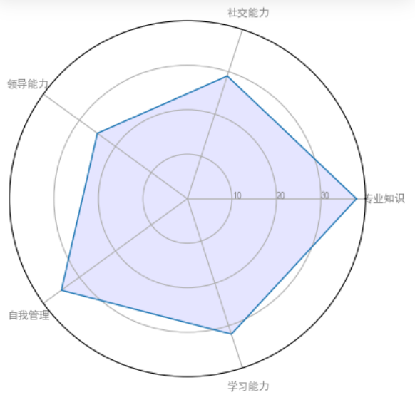
以下是对该图表的分析:
-
专业知识:个体A在专业知识方面得分最高,达到38分,显示出其在该领域的扎实基础。
-
社交能力:得分为29分,表明其在社交互动方面表现良好,但还有提升空间。
-
领导能力:得分为25分,显示出其在领导方面的潜力,但可能需要更多的经验和培训。
-
自我管理:得分为35分,表明其在自我管理和组织方面具有较强的能力。
-
学习能力:得分为32分,显示出其在学习新知识和技能方面的能力较强。
实验二:
数据准备
我们使用的数据集来自丹佛气溶胶源和健康研究,包括五个模拟的污染源(例如,汽车、木材燃烧等)在七种化学物质(硫酸盐、硝酸盐、元素碳、有机碳组分1、有机碳组分2、有机碳组分3、热解有机碳)上的排放比例。数据集还包括四种不同情景下的排放特征:无气相物种存在、仅存在一氧化碳(CO)、仅存在臭氧(O3)以及同时存在CO和O3。
代码实现
以下是使用Python和Matplotlib库绘制雷达图的代码:
import matplotlib.pyplot as plt
import numpy as np

from matplotlib.patches import Circle, RegularPolygon
from matplotlib.path import Path
from matplotlib.projections import register_projection
from matplotlib.projections.polar import PolarAxes
from matplotlib.spines import Spine
from matplotlib.transforms import Affine2D


def radar_factory(num_vars, frame='circle'):
    """
    Create a radar chart with `num_vars` Axes.

    This function creates a RadarAxes projection and registers it.

    Parameters
    ----------
    num_vars : int
        Number of variables for radar chart.
    frame : {'circle', 'polygon'}
        Shape of frame surrounding Axes.

    """
    # calculate evenly-spaced axis angles
    theta = np.linspace(0, 2*np.pi, num_vars, endpoint=False)

    class RadarTransform(PolarAxes.PolarTransform):

        def transform_path_non_affine(self, path):
            # Paths with non-unit interpolation steps correspond to gridlines,
            # in which case we force interpolation (to defeat PolarTransform's
            # autoconversion to circular arcs).
            if path._interpolation_steps > 1:
                path = path.interpolated(num_vars)
            return Path(self.transform(path.vertices), path.codes)

    class RadarAxes(PolarAxes):

        name = 'radar'
        PolarTransform = RadarTransform

        def __init__(self, *args, **kwargs):
            super().__init__(*args, **kwargs)
            # rotate plot such that the first axis is at the top
            self.set_theta_zero_location('N')

        def fill(self, *args, closed=True, **kwargs):
            """Override fill so that line is closed by default"""
            return super().fill(closed=closed, *args, **kwargs)

        def plot(self, *args, **kwargs):
            """Override plot so that line is closed by default"""
            lines = super().plot(*args, **kwargs)
            for line in lines:
                self._close_line(line)

        def _close_line(self, line):
            x, y = line.get_data()
            # FIXME: markers at x[0], y[0] get doubled-up
            if x[0] != x[-1]:
                x = np.append(x, x[0])
                y = np.append(y, y[0])
                line.set_data(x, y)

        def set_varlabels(self, labels):
            self.set_thetagrids(np.degrees(theta), labels)

        def _gen_axes_patch(self):
            # The Axes patch must be centered at (0.5, 0.5) and of radius 0.5
            # in axes coordinates.
            if frame == 'circle':
                return Circle((0.5, 0.5), 0.5)
            elif frame == 'polygon':
                return RegularPolygon((0.5, 0.5), num_vars,
                                      radius=.5, edgecolor="k")
            else:
                raise ValueError("Unknown value for 'frame': %s" % frame)

        def _gen_axes_spines(self):
            if frame == 'circle':
                return super()._gen_axes_spines()
            elif frame == 'polygon':
                # spine_type must be 'left'/'right'/'top'/'bottom'/'circle'.
                spine = Spine(axes=self,
                              spine_type='circle',
                              path=Path.unit_regular_polygon(num_vars))
                # unit_regular_polygon gives a polygon of radius 1 centered at
                # (0, 0) but we want a polygon of radius 0.5 centered at (0.5,
                # 0.5) in axes coordinates.
                spine.set_transform(Affine2D().scale(.5).translate(.5, .5)
                                    + self.transAxes)
                return {'polar': spine}
            else:
                raise ValueError("Unknown value for 'frame': %s" % frame)

    register_projection(RadarAxes)
    return theta


def example_data():
    # The following data is from the Denver Aerosol Sources and Health study.
    # See doi:10.1016/j.atmosenv.2008.12.017
    #
    # The data are pollution source profile estimates for five modeled
    # pollution sources (e.g., cars, wood-burning, etc) that emit 7-9 chemical
    # species. The radar charts are experimented with here to see if we can
    # nicely visualize how the modeled source profiles change across four
    # scenarios:
    #  1) No gas-phase species present, just seven particulate counts on
    #     Sulfate
    #     Nitrate
    #     Elemental Carbon (EC)
    #     Organic Carbon fraction 1 (OC)
    #     Organic Carbon fraction 2 (OC2)
    #     Organic Carbon fraction 3 (OC3)
    #     Pyrolyzed Organic Carbon (OP)
    #  2)Inclusion of gas-phase specie carbon monoxide (CO)
    #  3)Inclusion of gas-phase specie ozone (O3).
    #  4)Inclusion of both gas-phase species is present...
    data = [
        ['Sulfate', 'Nitrate', 'EC', 'OC1', 'OC2', 'OC3', 'OP', 'CO', 'O3'],
        ('Basecase', [
            [0.88, 0.01, 0.03, 0.03, 0.00, 0.06, 0.01, 0.00, 0.00],
            [0.07, 0.95, 0.04, 0.05, 0.00, 0.02, 0.01, 0.00, 0.00],
            [0.01, 0.02, 0.85, 0.19, 0.05, 0.10, 0.00, 0.00, 0.00],
            [0.02, 0.01, 0.07, 0.01, 0.21, 0.12, 0.98, 0.00, 0.00],
            [0.01, 0.01, 0.02, 0.71, 0.74, 0.70, 0.00, 0.00, 0.00]]),
        ('With CO', [
            [0.88, 0.02, 0.02, 0.02, 0.00, 0.05, 0.00, 0.05, 0.00],
            [0.08, 0.94, 0.04, 0.02, 0.00, 0.01, 0.12, 0.04, 0.00],
            [0.01, 0.01, 0.79, 0.10, 0.00, 0.05, 0.00, 0.31, 0.00],
            [0.00, 0.02, 0.03, 0.38, 0.31, 0.31, 0.00, 0.59, 0.00],
            [0.02, 0.02, 0.11, 0.47, 0.69, 0.58, 0.88, 0.00, 0.00]]),
        ('With O3', [
            [0.89, 0.01, 0.07, 0.00, 0.00, 0.05, 0.00, 0.00, 0.03],
            [0.07, 0.95, 0.05, 0.04, 0.00, 0.02, 0.12, 0.00, 0.00],
            [0.01, 0.02, 0.86, 0.27, 0.16, 0.19, 0.00, 0.00, 0.00],
            [0.01, 0.03, 0.00, 0.32, 0.29, 0.27, 0.00, 0.00, 0.95],
            [0.02, 0.00, 0.03, 0.37, 0.56, 0.47, 0.87, 0.00, 0.00]]),
        ('CO & O3', [
            [0.87, 0.01, 0.08, 0.00, 0.00, 0.04, 0.00, 0.00, 0.01],
            [0.09, 0.95, 0.02, 0.03, 0.00, 0.01, 0.13, 0.06, 0.00],
            [0.01, 0.02, 0.71, 0.24, 0.13, 0.16, 0.00, 0.50, 0.00],
            [0.01, 0.03, 0.00, 0.28, 0.24, 0.23, 0.00, 0.44, 0.88],
            [0.02, 0.00, 0.18, 0.45, 0.64, 0.55, 0.86, 0.00, 0.16]])
    ]
    return data


if __name__ == '__main__':
    N = 9
    theta = radar_factory(N, frame='polygon')

    data = example_data()
    spoke_labels = data.pop(0)

    fig, axs = plt.subplots(figsize=(9, 9), nrows=2, ncols=2,
                            subplot_kw=dict(projection='radar'))
    fig.subplots_adjust(wspace=0.25, hspace=0.20, top=0.85, bottom=0.05)

    colors = ['b', 'r', 'g', 'm', 'y']
    # Plot the four cases from the example data on separate Axes
    for ax, (title, case_data) in zip(axs.flat, data):
        ax.set_rgrids([0.2, 0.4, 0.6, 0.8])
        ax.set_title(title, weight='bold', size='medium', position=(0.5, 1.1),
                     horizontalalignment='center', verticalalignment='center')
        for d, color in zip(case_data, colors):
            ax.plot(theta, d, color=color)
            ax.fill(theta, d, facecolor=color, alpha=0.25, label='_nolegend_')
        ax.set_varlabels(spoke_labels)

    # add legend relative to top-left plot
    labels = ('Factor 1', 'Factor 2', 'Factor 3', 'Factor 4', 'Factor 5')
    legend = axs[0, 0].legend(labels, loc=(0.9, .95),
                              labelspacing=0.1, fontsize='small')

    fig.text(0.5, 0.965, '5-Factor Solution Profiles Across Four Scenarios',
             horizontalalignment='center', color='black', weight='bold',
             size='large')

    plt.show()
图表分析
通过运行上述代码,我们得到实验结果
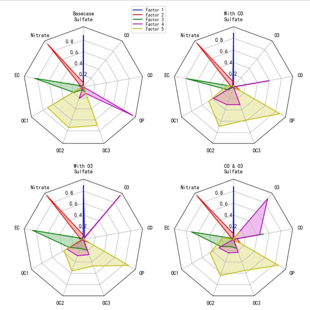 得出以下结论:
-
硫酸盐的排放:在所有情景中,硫酸盐的排放比例都相对较高,尤其是在基础情景中。这表明硫酸盐是一个主要的污染物,需要重点关注。
-
一氧化碳和臭氧的影响:一氧化碳和臭氧的存在对硫酸盐的排放有抑制作用,同时增加了它们自身的排放。这可能与它们在大气中的化学反应有关。
-
污染源的多样性:不同情景下的污染源排放特征差异显著,这表明污染源的多样性和复杂性,需要综合考虑多种因素来制定有效的污染控制策略。
这些雷达图为我们提供了一个直观的方式来比较和分析不同情景下的污染源排放特征,有助于我们更好地理解污染物的来源和影响,从而为环境管理和政策制定提供科学依据。

DAMO开发者矩阵,由阿里巴巴达摩院和中国互联网协会联合发起,致力于探讨最前沿的技术趋势与应用成果,搭建高质量的交流与分享平台,推动技术创新与产业应用链接,围绕“人工智能与新型计算”构建开放共享的开发者生态。
更多推荐

 18
18 0
0- 0


 已为社区贡献1条内容

所有评论(0)