uniapp去掉顶部导航栏后计算手机安全区距离,css背景模糊效果
问题:
1.uniapp去掉顶部导航栏后计算手机安全区距离
2.模糊背景的局部清晰
3.去除overflow: auto;带来的滚动条(没有滚动条也可以滚动)
4.监测页面滑动使用的方法
5.data中存储的数据在css中使用
6.背景颜色渐变
7.实现动态背景模糊效果
解决:
1.uniapp去掉顶部导航栏后计算手机安全区距离
var(--status-bar-height) ;
uniapp自带可以计算手机设备安全区的代码,使用 var(--status-bar-height) ; 便可直接获取
padding-top: var(--status-bar-height) ;//给组件加个上边距
2.模糊背景的局部清晰
background: inherit;
使用background: inherit; css语句通过继承就可以实现
<body> <div class="father"> <div class="son">Background</div> </div> </body>
<style>
        .father {
            width: 800px;
            height: 800px;
            position: relative;
            background: url("../img/7.jpg") no-repeat fixed;
            padding: 1px;
            box-sizing: border-box;
        }

        .father:after {
            content: "";
            width: 100%;
            height: 100%;
            position: absolute;
            background: inherit;
            filter: blur(3px);
            z-index: 1;
        }

        .son {
            position: absolute;
            left: 40%;
            top: 30%;
            width: 200px;
            height: 200px;
            text-align: center;
            background: inherit;
            z-index: 15;
            box-shadow: 0 0 10px 6px rgba(0, 0, 0, .5);
        }
    </style>
这个实现原理主要就是要应用好background:inherit这个属性,背景的继承。这里不能用transform这个属性,不然背景会偏移,导致达不到清晰的效果。
inherit,使用继承
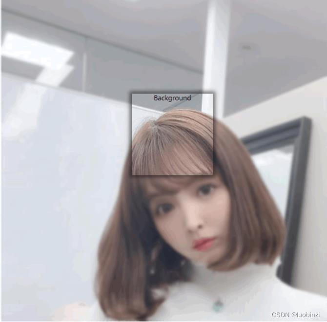
局部模糊原文链接:https://blog.csdn.net/m0_47191887/article/details/115873419
3.去除overflow: auto;带来的滚动条(没有滚动条也可以滚动)
div{
overflow:auto;
}
div::-webkit-scrollbar{
display: none;
}
4.监测页面滑动使用的方法
使用onPageScroll() { }方法可以监测页面滑动时距离顶部的距离
注:onPageScroll(){} 方法与methods方法同级
//监测页面滑动
  onPageScroll(e) {
   // console.log('[页面滚动]',e)
    if(e.scrollTop > this.Topdistance){
      this.isFixedTop = true
    }else{
      this.isFixedTop = false
    }
  },
5.data中存储的数据在css中使用
通过 v-bind 将后端的数据绑定在自定义 HTML 属性上, 然后通过 CSS 的 attr() 函数获取该属性
<template>
  <div>
    <div class="box"
    :data-content="obj.desc"
    :data-percent="obj.percent"></div>
  </div>
</template>

<script>
  export default {
    name: 'Student',
    data() {
      return {
        obj: {
          percent: '30%',
          desc: '哈哈哈哈哈哈'
        }
      }
    },
    methods: {
    },
  }
</script>

<style>
.box {
  width: 400px;
  height: 200px;
  border: 1px solid salmon;
  position: relative;
}
.box::before, .box::after {
  position: absolute;
  top: 0; bottom: 0;
}
.box::before {
  content: attr(data-content);
  left: 0;
  right: calc(100% - attr(data-percent));
  background-color: deepskyblue;
}
.box::after {
  content: attr(data-content);
  right: 0;
  left: attr(data-percent);
  background-color: deeppink;
}
</style>
原文链接:https://blog.csdn.net/broken_promise/article/details/124628567
6.背景颜色渐变
使用linear-gradient
background-image: linear-gradient(to right, rgba(255,0,0,0), rgba(255,0,0,1));
7.实现动态背景模糊效果
使用关键帧动画实现
在需要的class中用 animation 引用
<style>
        @-webkit-keyframes blur {
    0% {
        /* Chrome, Opera */
        -webkit-filter: blur(20px);
        -moz-filter: blur(20px);
        -ms-filter: blur(20px);
        filter: blur(20px);
    }
    50% {
        -webkit-filter: blur(15px);
        -moz-filter: blur(15px);
        -ms-filter: blur(15px);
        filter: blur(15px);
    }
    100% {
        -webkit-filter: blur(5px);
        -moz-filter: blur(5px);
        -ms-filter: blur(5px);
        filter: blur(5px);
    }
}

img{
    animation: blur 5s linear 0s 3;
}
    </style>
</head>
<body>
    <div>
        <img src="./img/7.jpg" alt="">
    </div>
</body>

DAMO开发者矩阵,由阿里巴巴达摩院和中国互联网协会联合发起,致力于探讨最前沿的技术趋势与应用成果,搭建高质量的交流与分享平台,推动技术创新与产业应用链接,围绕“人工智能与新型计算”构建开放共享的开发者生态。
更多推荐



 1
1 0
0- 0


 已为社区贡献1条内容

所有评论(0)