实战1——芯片数据挖掘
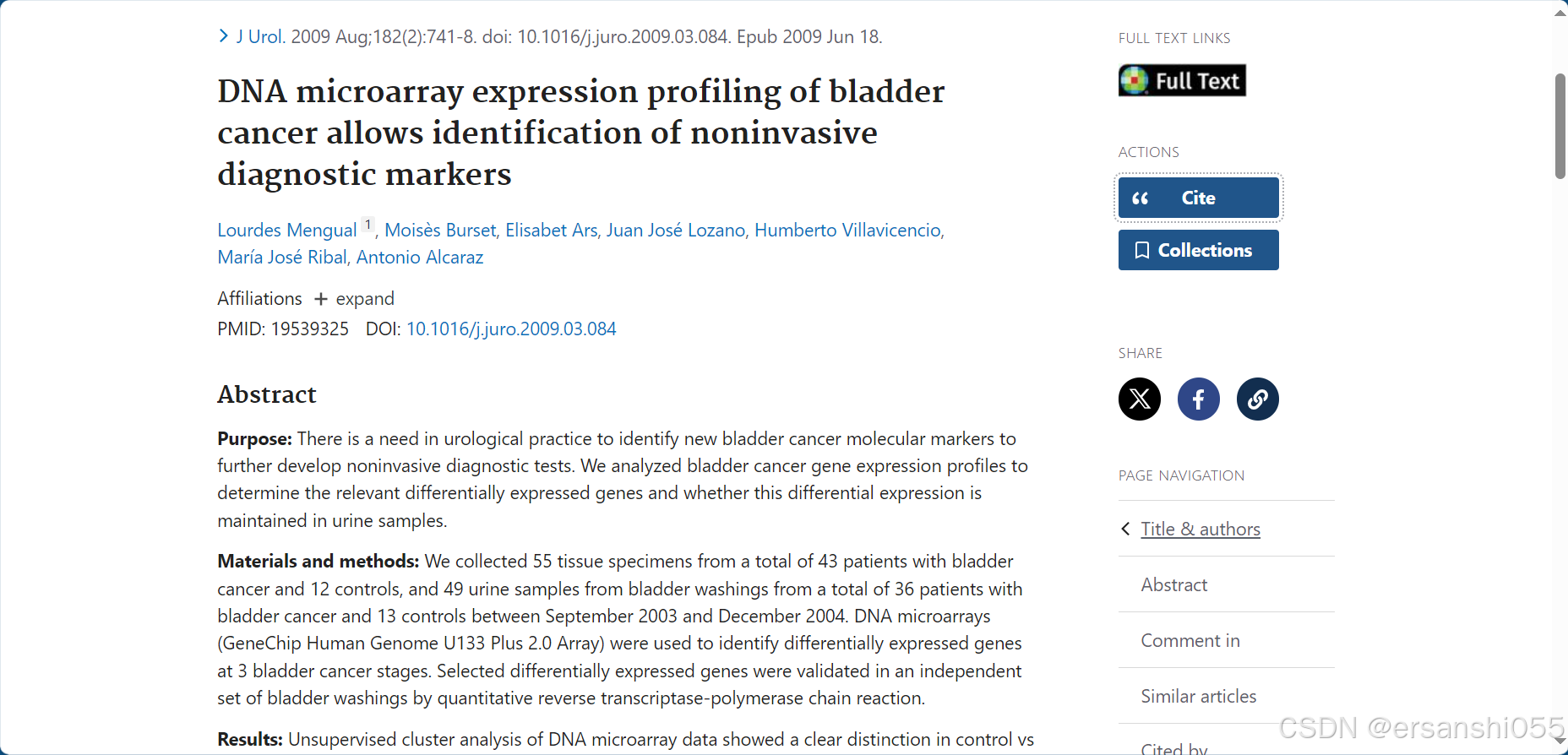
文章来源:Mengual L, Burset M, Ars E, Lozano JJ, Villavicencio H, Ribal MJ, Alcaraz A. DNA microarray expression profiling of bladder cancer allows identification of noninvasive diagnostic markers. J Urol. 2009 Aug;182(2):741-8. doi: 10.1016/j.juro.2009.03.084. Epub 2009 Jun 18. PMID: 19539325.
使用了GPL570平台的数据,12个样本,4组数据,我们来做一次完整的分析,数据处理过程,数据加载、log2转换、ID转换、数据分组;数据可视化,火山图、热图和GO/KEGG富集分析等。
一、数据下载及读取
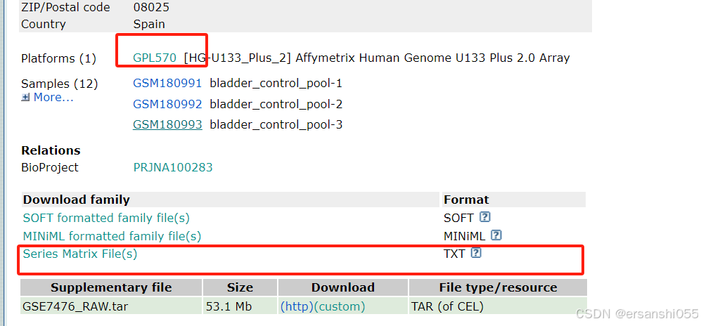
GEO数据下载
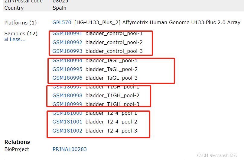
芯片数据:GSE7476,GEO Accession viewer
加载数据
##----------GEO_结肠癌芯片数据处理---------------------
getwd()
library(readr)
library(tidyverse)
library(ggplot2)
list.files()
##-----------GSE7476数据获取和读取---------------------
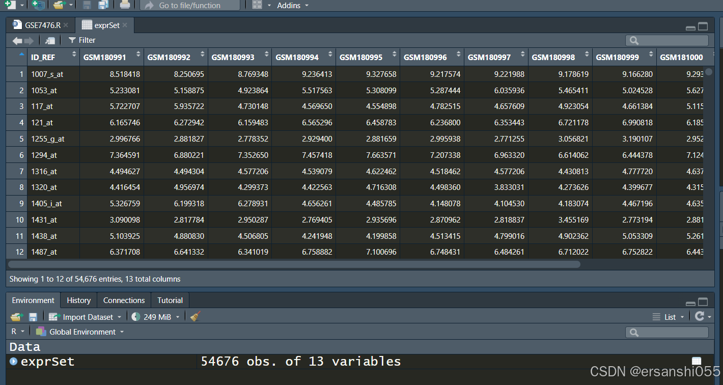
exprSet <- read_tsv("GSE7476_series_matrix.txt.gz",skip = 69)
exprSet <- data.frame(exprSet)
class(exprSet)
head(exprSet[, 1:5]) #查看前几行
二、整理数
芯片数据清洗-log2转换
## 获得行为探针ID名称,列为样本名称的表达矩阵。
rownames(exprSet) <- exprSet$ID_REF #将ID_REF列设置为行名
exprSet <- exprSet[,-1] #移除原来的ID_REF列(现在已作为行名)

########--------芯片数据清洗(log2转换和数据标准化)--------########
##使用read_tsv读取的数据进行后续操作,先进行log2转换
ex <- exprSet  #赋值ex变量,后续方便处理

qx <- as.numeric(quantile(ex, c(0.00, 0.25, 0.5, 0.75, 0.99, 1.0), na.rm=T))#计算关键分位数

LogC <- (qx[5] > 100) ||
    (qx[6]-qx[1] > 50 && qx[2] > 0) ||
    (qx[2] > 0 && qx[2] < 1 && qx[4] > 1 && qx[4] < 2) #判断是否需要log2转换的条件

if (LogC) {
    ex[which(ex <= 0)] <- NaN
    exprSet <- log2(ex)
    print("log2 transform finished")
    }else{
        print("log2 transform not needed")
        }#执行转换
#"log2 transform not needed"表示不需要log2转换


# 安装BiocManager并安装limma包
#if (!requireNamespace("BiocManager", quietly = TRUE))
    #install.packages("BiocManager")
#BiocManager::install("limma")# 使用BiocManager安装limma

# 加载limma包
library(limma)
boxplot(exprSet,outline=FALSE, notch=T, las=2)
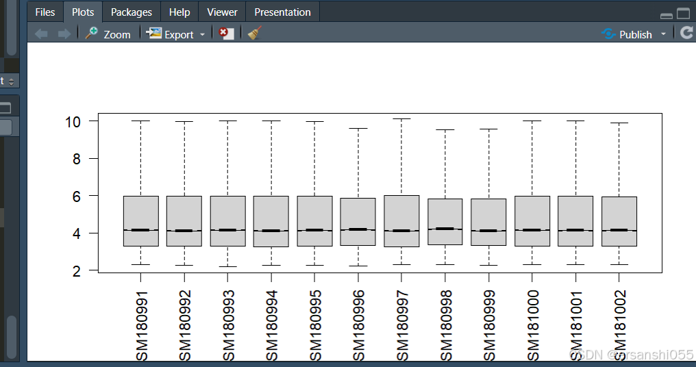
根据箱线图,样本之间存在差异,所以需要进行数据标准化
数据标准化
##根据箱线图,样本之间存在差异,所以需要进行数据标准化
exprSet = normalizeBetweenArrays(exprSet)
boxplot(exprSet,outline=FALSE, notch=T, las=2,
        boxwex = 0.6, col = "orange")

class(exprSet) #标准化后,数据为 [1] "matrix" "array" 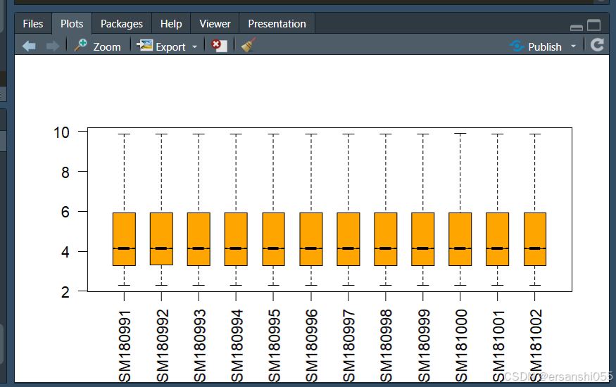
探针ID及基因名称的转换、去重复
exprSet <- data.frame(exprSet) #转为数据框
##探针ID和基因名的转换
library(readr)
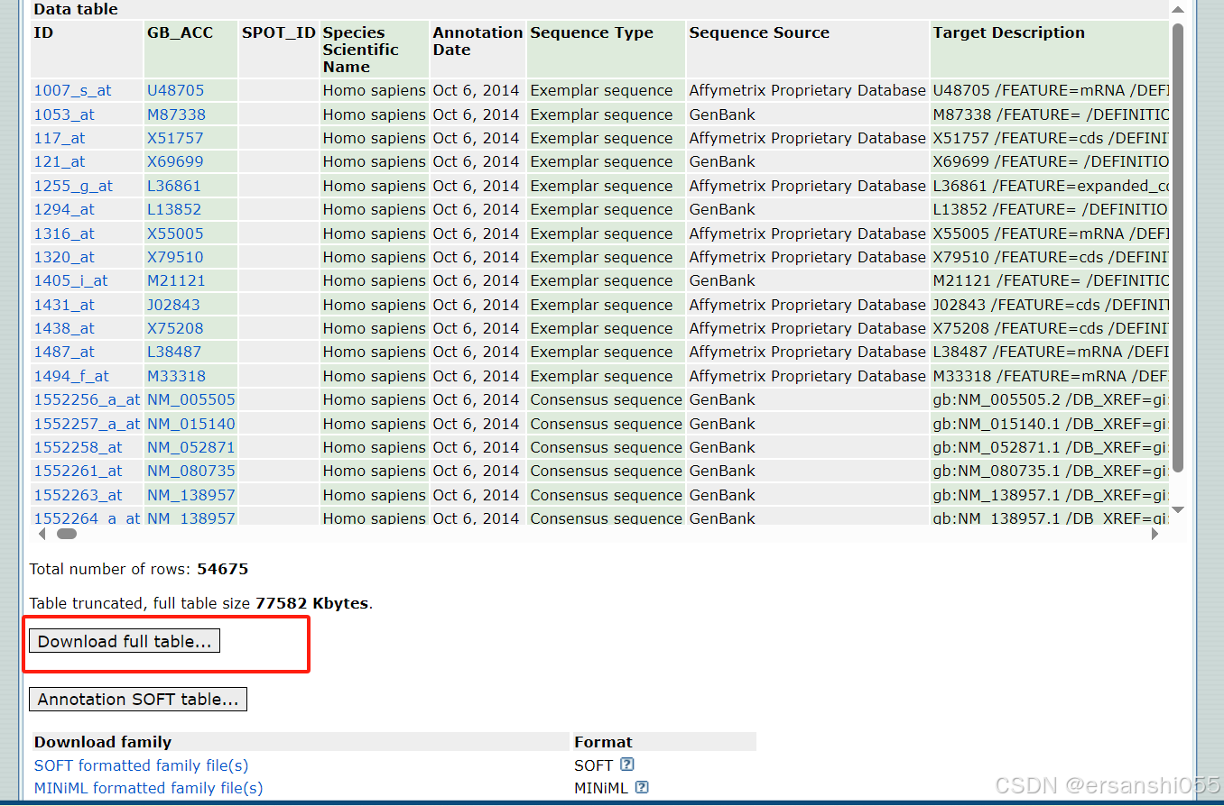
probe <- read_tsv("GPL570-55999.txt", skip = 16) #GEO探针格式为tsv
Probe_ID <- select(probe,c("ID","Gene Symbol"))
ids <- Probe_ID[-grep('///',Probe_ID$"Gene Symbol"),] #删除重复
library(dplyr)
library(tidyverse)
exprSet1 <- exprSet %>%
rownames_to_column("ID") #高频操作
exprset1 <- inner_join(ids,exprSet1,by="ID")
# length(exprset1$ID)
# length(exprset1$'Gene Symbol')
exprset1 = avereps(exprset1[,-c(1,2)], #高频操作
ID = exprset1$'Gene Symbol')
exprset1 <- data.frame(exprset1) #获得行是基因名称,列是样本名称的表达矩阵(清洁数据)
ids <- Probe_ID[-grep('///', Probe_ID$"Gene Symbol"),]:通过grep函数查找Probe_ID数据框中Gene Symbol列包含///的行索引,然后取反得到不包含///的行索引,最后根据这些索引筛选出相应的行,结果存储在ids中。通常///表示一个基因有多个符号,这一步是为了去除这些有多个基因符号的行
样本分组
########--------样本分组操作(以及差异分析)--------########
## 样本分组
exprset2 <- exprset1
group1 <- c(rep("normal",3),rep("cancer",9))
group1 <- factor(group1,levels = c("normal","cancer"))

## 分组矩阵
# model.matrix(formula, data)  #基本公式
design <- model.matrix(~0 + group1) # 没有设置默认分组
colnames(design) <- levels(group1)
design
分析
## 比较矩阵
contrast.matrix <- makeContrasts( "cancer - normal", levels = design)

## 拟合模型
fit1 <- lmFit(exprset2,design)
fit1 <- contrasts.fit(fit1, contrast.matrix)  # 转换为对比模型
fit2 <- eBayes(fit1)                          # 经验贝叶斯评估
allDiff = topTable(fit2,adjust='fdr',coef=1,number=Inf,sort.by="logFC") #差异分析,infinite

diffSig <- allDiff[with(allDiff, (abs(logFC)>1 & adj.P.Val < 0.05 )), ]
# write.table(diffSig,file="diff.xls",sep="\t",quote=F)
diffUp <- allDiff[with(allDiff, (logFC>1 & adj.P.Val < 0.05 )), ]
# write.table(diffUp,file="up.xls",sep="\t",quote=F)
diffDown <- allDiff[with(allDiff, (logFC<(-1) & adj.P.Val < 0.05 )), ]
# write.table(diffDown,file="down.xls",sep="\t",quote=F)
三、可视化
火山图(ggplot)
基本绘图
########--------差异基因的可视化--------########
##数据整理和条件设置
data <- allDiff
data1 <- data %>%
  rownames_to_column("Genes")  #行名转为Genes为列名的一列
data2 <- data1 %>%
  mutate(regulate = case_when(logFC >= 1 & adj.P.Val <= 0.05 ~ "up",
                              logFC <= -1 & adj.P.Val <= 0.05 ~ "down",
                              TRUE ~ "NS"))

## 使用ggplot2包绘制火山图
# 基本绘图
library(ggplot2)
ggplot(data2,aes(logFC,-log10(adj.P.Val)))+
  geom_point()+
  labs(x=expression(Log[2]*" Fold Change"),
       y=expression(-Log[10]*" (p value)")) #修改坐标轴命名细节

# 美化绘图
ggplot(data2,aes(logFC,-log10(adj.P.Val),    #分别给正负显著变化的基因在图中根据颜色、大小标注出来
                 color=factor(regulate),
                 size=factor(regulate)))+
  geom_point()+
  labs(x=expression(Log[2]*" Fold Change"),
       y=expression(-Log[10]*" (p value)"))+
  theme_grey(base_size = 15)+
  scale_color_manual(values = c('blue','grey','red'))+
  scale_size_manual(values = c(2,1,2))+
  theme(legend.title = element_blank(), #图例的设置参数
        legend.position = "right",      #标签位置为right
        legend.background = element_rect(fill='transparent'))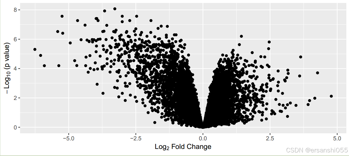
美化
# 增加注释基因
library(ggrepel)

# 筛选出ToP基因,并形成新列
data2$selectedgene <- ifelse(data2$adj.P.Val < 0.0001 & abs(data2$logFC) > 3,data2$Genes,NA)

ggplot(data2,aes(logFC,-log10(adj.P.Val),
                 color=factor(regulate),
                 size=factor(regulate)))+
  geom_point()+
  labs(x=expression(Log[2]*" Fold Change"),
       y=expression(-Log[10]*" (p value)"))+
  theme_grey(base_size = 15)+
  scale_color_manual(values = c('skyblue','grey','tomato'))+
  scale_size_manual(values = c(2,1,2))+
  theme(legend.title = element_blank(),
        legend.position = "right",
        legend.background = element_rect(fill='transparent'))+
  #用ggrepel包给选择的基因加上文本标签
  geom_text_repel(aes(label=selectedgene), color="black",size=3,
                  box.padding=unit(0.5, "lines"),
                  point.padding=NA,
segment.colour = "black") 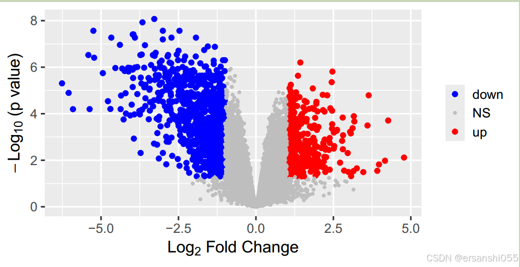
增加注释基因
# 增加辅助线
data2$selectedgene <- ifelse(data2$adj.P.Val < 0.0001 & abs(data2$logFC) > 3,data2$Genes,NA) # 筛选出满足特定条件的基因,将其名称存储在新列 selectedgene 中

ggplot(data2,aes(logFC,-log10(adj.P.Val), # 以 logFC 为 x 轴,-log10(adj.P.Val) 为 y 轴
                 color=factor(regulate),
                 size=factor(regulate)))+
  geom_point()+ #绘制散点图
  labs(x=expression(Log[2]*" Fold Change"),
       y=expression(-Log[10]*" (p value)"))+#设置x,y标签
  theme_grey(base_size = 15)+ # 设置主题为灰色主题,基础字体大小为 15
  scale_color_manual(values = c('skyblue','grey','tomato'))+ # 设置颜色映射,
  scale_size_manual(values = c(2,1,2))+ #设置点的大小映射
  theme(legend.title = element_blank(),
        legend.position = "right",
        legend.background = element_rect(fill='transparent'))+#图例主题
  #用ggrepel包给选择的基因加上文本标签
  geom_text_repel(aes(label=selectedgene), color="black",size=3,
                  box.padding=unit(0.5, "lines"),
                  point.padding=NA,
                  segment.colour = "black") +
  geom_hline(yintercept = -log10(0.001),linetype=2,cex=1)+
  geom_vline(xintercept = c(-1,1),linetype=2,cex=1)+ #添加辅助线垂直、水平
  annotate("text",x=-1.9,y=3.8,label="p value=0.001",size=3)+ #添加一个说明"p value=0.001"
  theme(axis.text= element_text(colour = "black"),
        panel.border = element_rect(size=1,fill='transparent'))#绘图区域边框,坐标轴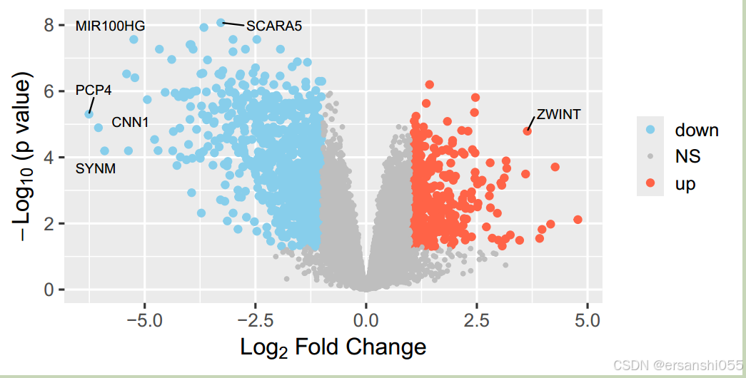
加辅助线
# 增加辅助线
data2$selectedgene <- ifelse(data2$adj.P.Val < 0.0001 & abs(data2$logFC) > 3,data2$Genes,NA)

ggplot(data2,aes(logFC,-log10(adj.P.Val),
                 color=factor(regulate),
                 size=factor(regulate)))+
  geom_point()+
  labs(x=expression(Log[2]*" Fold Change"),
       y=expression(-Log[10]*" (p value)"))+
  theme_grey(base_size = 15)+
  scale_color_manual(values = c('skyblue','grey','tomato'))+
  scale_size_manual(values = c(2,1,2))+
  theme(legend.title = element_blank(),
        legend.position = "right",
        legend.background = element_rect(fill='transparent'))+
  #用ggrepel包给选择的基因加上文本标签
  geom_text_repel(aes(label=selectedgene), color="black",size=3,
                  box.padding=unit(0.5, "lines"),
                  point.padding=NA,
                  segment.colour = "black") +
  geom_hline(yintercept = -log10(0.001),linetype=2,cex=1)+  #添加辅助线
  geom_vline(xintercept = c(-1,1),linetype=2,cex=1)+
  annotate("text",x=-1.9,y=3.8,label="p value=0.001",size=3)+ #添加一个注明
  theme(axis.text= element_text(colour = "black"),
        panel.border = element_rect(size=1,fill='transparent'))
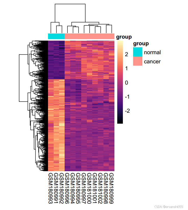
热图(pheatmap)
基础
## 使用pheatmap绘制热图
library(pheatmap)
library(viridisLite)

heatdata <- exprset2[rownames(diffSig),]
pheatmap(heatdata)
美化
annotation_col <- data.frame(group1)            ##创建列的注释数据框
rownames(annotation_col) <- colnames(heatdata)  ##行名换为样本名

pheatmap::pheatmap(heatdata,           #热图数据
                   cluster_rows = F,   #行聚类
                   cluster_cols =F,    #列聚类,可以看出样本之间的区分度
                   annotation_col =annotation_col,
                   show_colnames=F,
                   scale = "row",      #以行来标准化,这个功能很不错
                   color =colorRampPalette(c("blue", "white","red"))(10))


##美化热图
pheatmap(heatdata,
         cluster_rows = TRUE,
         cluster_cols = TRUE,
         annotation_col =annotation_col,
         annotation_legend=TRUE,
         show_rownames = F,
         scale = "row",
         color = magma(100, alpha = 1, begin = 0, end = 1, direction = 1),
         cellwidth = 10,
         cellheight = 0.2,
         fontsize = 10)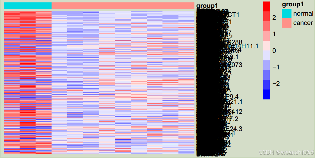
上调基因
##上调基因
topexp = exprset2[rownames(diffUp)[1:30],] #选取diffUP中前30个上调基因的行名放在topexp

#创建annoannotation_col数据框
annotation_col = data.frame(group = group1) #创建一个名为 annotation_col 的数据框,其中只有一列名为 group,其值来自于变量 group1
rownames(annotation_col) = colnames(exprset2)#接着将 annotation_col 的行名设置为 exprset2 的列名,这样可以确保样本和其分组信息一一对应

pheatmap(topexp,annotation_col = annotation_col,
         color = colorRampPalette(c("blue", "gray", "red"))(10),# color 参数指定了热图颜色的渐变范围,使用 colorRampPalette 函数生成一个从蓝色到灰色再到红色的 10 级颜色渐变
         cellwidth = 10,
         cellheight = 8, #尺寸
         fontsize  = 8) #文字大小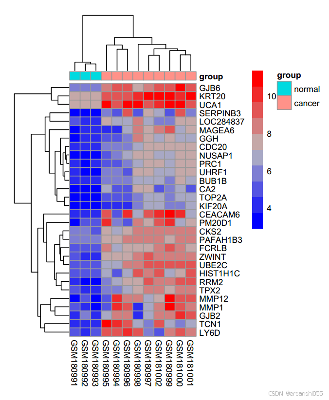
参考资料:
Mengual L, Burset M, Ars E, Lozano JJ, Villavicencio H, Ribal MJ, Alcaraz A. DNA microarray expression profiling of bladder cancer allows identification of noninvasive diagnostic markers. J Urol. 2009 Aug;182(2):741-8. doi: 10.1016/j.juro.2009.03.084. Epub 2009 Jun 18. PMID: 19539325.

DAMO开发者矩阵,由阿里巴巴达摩院和中国互联网协会联合发起,致力于探讨最前沿的技术趋势与应用成果,搭建高质量的交流与分享平台,推动技术创新与产业应用链接,围绕“人工智能与新型计算”构建开放共享的开发者生态。
更多推荐


 15
15 0
0- 0


 已为社区贡献2条内容

所有评论(0)