Python数据分析实战【第三章】3.9-Matplotlib直方图【python】
1.直方图+密度图s = pd.Series(np.random.randn(1000))s.hist(bins = 20,histtype = 'bar',align = 'mid',orientation = 'vertical',alpha=0.5,normed =True)# bin:箱子的宽度# n...
·
1.直方图+密度图
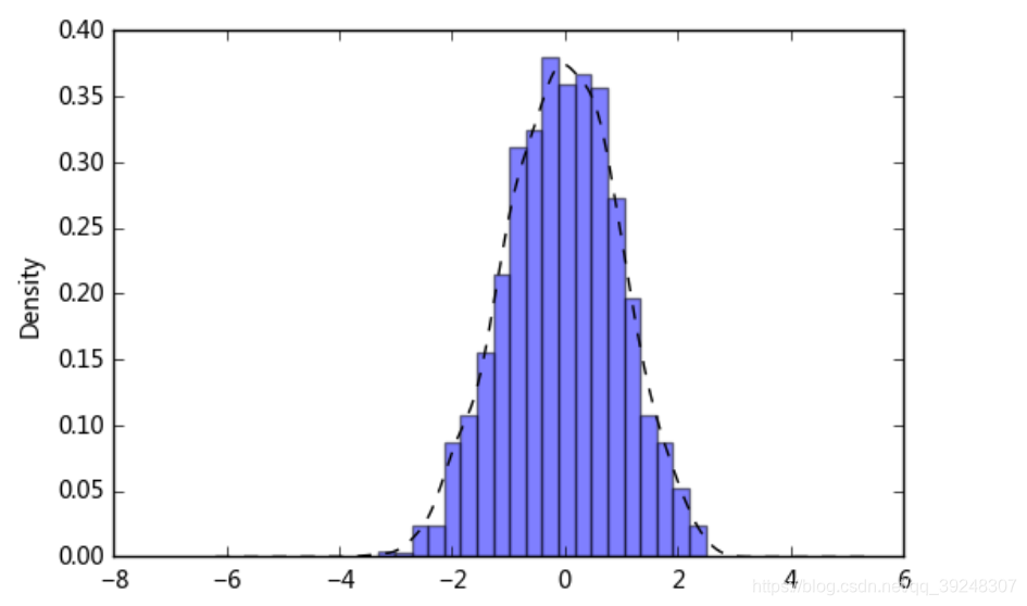
s = pd.Series(np.random.randn(1000))
s.hist(bins = 20,
       histtype = 'bar',
       align = 'mid',
       orientation = 'vertical',
       alpha=0.5,
       normed =True)
# bin:箱子的宽度
# normed 标准化,配合密度图
# histtype 风格,bar,barstacked,step,stepfilled
# orientation 水平还是垂直{‘horizontal’, ‘vertical’}
# align : {‘left’, ‘mid’, ‘right’}, optional(对齐方式)

s.plot(kind='kde',style='k--')
# 密度图
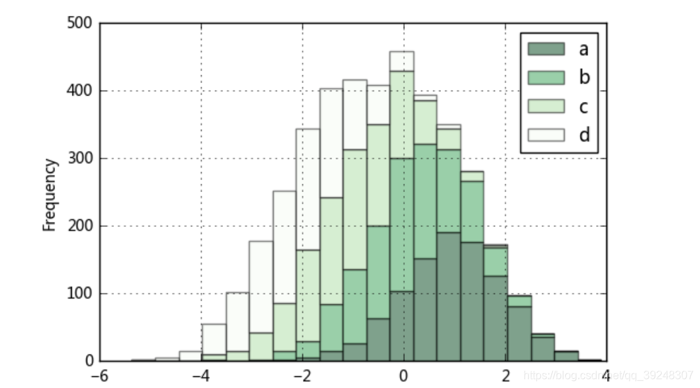
2.堆叠直方图:plt.plot.hixt(stacked=True)
plt.figure(num=1)
df = pd.DataFrame({'a': np.random.randn(1000) + 1, 'b': np.random.randn(1000),
'c': np.random.randn(1000) - 1, 'd': np.random.randn(1000)-2},
columns=['a', 'b', 'c','d'])
df.plot.hist(stacked=True,
bins=20,
colormap='Greens_r',
alpha=0.5,
grid=True)
# 使用DataFrame.plot.hist()和Series.plot.hist()方法绘制
# stacked:是否堆叠
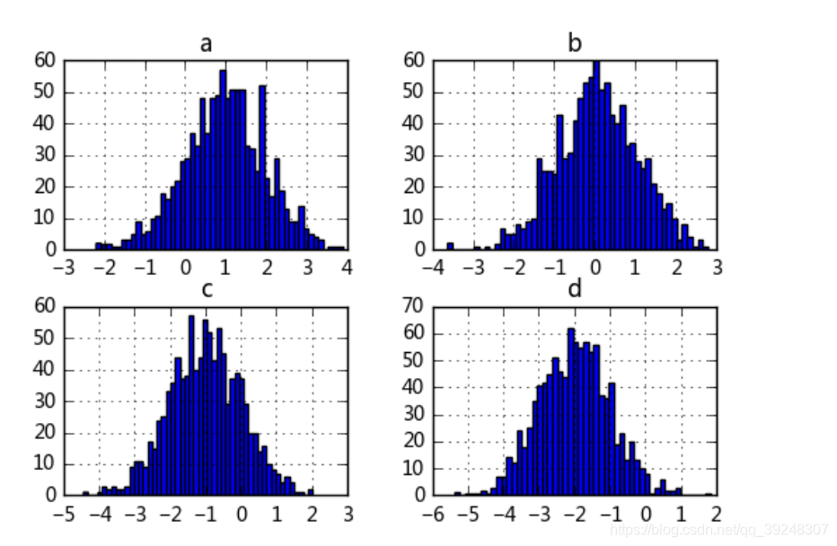
df.hist(bins=50)
# 生成多个直方图

DAMO开发者矩阵,由阿里巴巴达摩院和中国互联网协会联合发起,致力于探讨最前沿的技术趋势与应用成果,搭建高质量的交流与分享平台,推动技术创新与产业应用链接,围绕“人工智能与新型计算”构建开放共享的开发者生态。
更多推荐
 0
0 0
0- 0


 已为社区贡献2条内容

所有评论(0)